
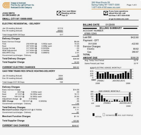
Over the years, I have developed a simple method to design, assess, and compare security product infographics (dashboards, reports, etc). I’ve done workshops on this method and while I have some time between jobs, I am going to post it here and drop me a comment or link to it if you find it useful. The problem I am addressing here is that for analytical outcomes to be effective for your organization, they need to be competent in addressing the critical questions you have by the minute, hour, daily, weekly, etc Let’s jump right into it. The main assessment to be made with any type of analytical outcome is ‘what does this answer for me?’. The infographics on your utilities bill (image below) is there to primarily answer the question: Why am I being billed this amount? Another example being a simple score board format is answering the question : Who won?. I’m being general here but I am trying to emphasize the point that all the data being presented in a infographic is intentionally trying to answer a question or a set of questions for you. When things go sideways is when you don’t know what question is being asked, the question you have in mind is not what the infographic delivers, or no question was involved in the design and what you are trying to understand is just data noise because it was easy to plot.
What better question-centric game to play than Jeopardy. For those who have never played Jeopardy the game, Jeopardy is a quiz show that has a unique answer-and-question format in which contestants are presented with clues in the form of answers and must phrase their responses in the form of a question. You see where I am coming from here as the designer of the infographic is presenting you with an answer; you are to look at it and tell me which question you think it is answering.
Let’s go through a few examples.
Example 01
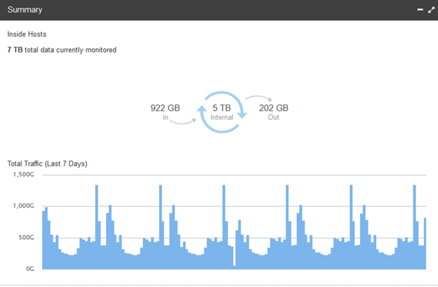
The example 01 question being asked is: How much traffic has traversed IN and OUT of my selected group in the last 7 days?
Let’s try another one.
Example 02
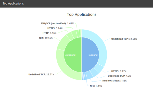
The example 02 question being asked is: What applications are used most on my network? This is incomplete in that it did not address time. Is this since the system has been running, the last week, 24hrs? We don’t know and so by asking the question it is evident that the visual is incomplete.
When it is obvious to a community what question is being answered by the infographic, the semantics of that domain is stable across the community but consider infographics that cut across multiple personas (IT administrator, business executive, law enforcement, auditors, etc). It is common for the same graphic and timeline to be understood by different personas with different questions. Use this learning to help the design evolve to better serve those individuals with the least amount of compromise to one another.
I will leave you with an exercise that I do at my workshops. A week prior, have each person in the workshop send you a graphic from a product they find critical to their job, and a 2nd graphic from a product they find utterly useless. Lets say you have 10 folks in your workshop, you now have 20 images to review together as a class. Put up the first image and challenge the entire room to explain this visual in the form of a question. Depending on the graphics you pulled, the answers commonly are:
- Are critical systems currently in product all running without error?
- How many threats have we addressed in the hour?
- What user on my network is associated with the most severe alarms in the last 24hrs?
Pay close attention to graphics being presented that have more than one valid question being asked of it. Ask those folks their roles and map those questions to their roles to start to build an inventory of their competency question.
The complement to this discovery session in the workshop is to ask then of the attendees what are the top questions they need answered and in what timeframe. Don’t be surprised if there are questions being asked that are not addressed by any of the product they are using.
If you do use these ideas in whole or in part, shoot me a note tk@tkonsecurity.com I’d be happy to follow up with more information on this method.
Aloha, –tk
